There are two options for your negatives – actual film or digital negatives. There is a lot to be said for actual negatives but as I haven’t taken too many black and white photographs in 10×8 I thought it best to start with digital negatives (it gives you more control as well).
Digital Negatives
Although I’ve gone through some of these stages already I thought I’d start again as I’m now using some slightly different chemicals and processes. It’s also good to rerun some of these things once you’ve learned the basics (and I think it’s a process that you end up going through again and again as you try out different papers, chemistry, treatments, humidity, etc., etc).
One of the big advantages of the digital negative process is that you can come up with a working methodology and then stick to it, making any changes to the final result by changing your image in Photoshop. The main downside of this is that you have to calibrate the system somehow.
This calibration process typically has two steps.
- Work out what your base exposure needs to be
- Work out a curve that will be used to create a smooth linear progression from blacks to whites.
Base Exposure
This is probably the easiest step, particularly if you have a Stouffer step wedge.
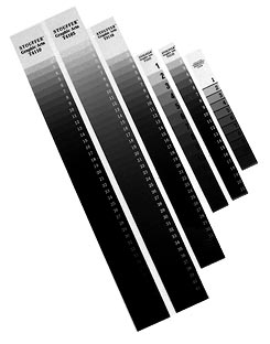
If you make an exposure quite a bit longer than you would expect. Let’s say a 30 minute exposure to begin with but this sort of depends on how strong your UV light source is. Then you can use the result of this to work out an exposure that just gives you full black where your negative is clear. Here’s a diagram showing how to make a test exposure.
First of all you can see that we use a sample of the OHP film that we’re going to use to make sure we include that in our equations (after all it blocks a fair bit of UV light). We then check the end result to find out which step creates a full black. If the full black occurs at a step that shows -1 stop then we know our exposure should be 30/2 = 15 minutes. Here’s my step wedge.
Types of Digital Negative
There are three main types of digital negative you can make.
- native inks and native driver.
- native inks but dedicated software
- custom inks with dedicated software
Native Inks and Native Driver
The goal of this method is to find the colour and tone that block UV the most. To do this you can print out a spectrum of colour and tones, make a negative out of it and then a UV print and look for the area that is lightest. This is the system that most people will use.
Native Inks and Custom Driver
Custom printer drivers have been written that let you mix your own sets of inks together. In order to do this, you make a step wedge of each printer colour and do some (arcane) magic and then you have a fancy preset that performs very well. The advantage of this is that because the system can use multiple overlaid ink colours, the dithering should be better. A good example of this, and the most used I think, is Quadtone RIP.
Custom Inks and Custom Driver
Finally, we have the piece de resistance. Using a set of dilutions of carbon (possibly with coatings to help it work in an inkjet nozzle) and a custom software application (QuadtoneRIP for instance). The two examples I know of are the Eboni-6 system and the Piezography system
I hopefully will end up with the final system but for our first tutorials we’ll cover the first two systems.
In the next article we’ll take a look at establishing your base exposure
You may want to check out Jon Cones PiezoDN when its officially launched in a few days time
http://piezodn.inkjetmall.com/
Yes I’m looking forward to seeing if he can get support for bigger printers. As soon as he does I might be in! Otherwise it’s a 7880 and pos/neg inks
x880 printers coming next.
cheers, Walker (R&D of PiezoDN)
I’ll be buying!
Lemme know how it goes. So far people are super happy w/ it and making prints they actually could not make w/ other systems.
Turnkey (aka ‘black box’) systems such as PiezoDN, and that offered by HP on their Z3200, are great if you want to make excellent prints straight out of the box (well, maybe not the HP solution, I was never that impressed with it). But, and it’s a big but, you are dependent on the support of the manufacturer. HP gave up on their digital negative system, leaving users facing a dead end. I’m sure Cone will support their’s for as long as they are around, but how long is that exactly ? My advice to anyone starting out (and I’ve been doing this for almost two decades), or those who want ultimate control, is ‘roll your own’ and be beholden to (almost) no one. Still the best starting place is with Dan Burkholder’s original digital negative system and the (free) Photoshop ChartThrob plug-in. And you don’t need to buy the latest and greatest printer. Even an old Epson 2200 fitted with original Ultrachrome inks (a great inkset for digital negatives) is capable of producing negatives with smooth as silk highlights and beautiful tonal transitions. Once you have mastered DB’s method, you will be able to produce digital negatives for all processes (not just the ‘supported’ ones) without being dependent on 3rd party RIPs, ‘curves’ or inksets. If you want, you can go on and explore PDN, QTRip, PiezoDN etc., but the truth is that the ‘problem’ of producing digital negatives the equal of (or better than) traditional silver-based ones was solved over 20 years ago. The secrets to making great prints lie where they always have: with the photographer, the paper, the chemistry, and the vision/skill of the printer.
My problem (and the reason I’m moving to Jon Cone’s system) is the granularity problems in the highlights with ‘normal’ (i.e. quadtonerip + epson k7) systems. I’m not sure there is a solution to this. If you have one I would love to know.
PiezoDN is actually a software for calibrating the darkroom. It’s a radical intellectual departure from any other dig-neg system as this process enables ICC profiling of a darkroom negative from the printed densities (something that has never been done before). Also, at IJM/Cone-Editions we essentially invented the fine-art inkjet industry 30 years ago. We made pigment ink for Epson printers before Epson did and were the first to R&D Roland IRIS for fine-art. We aren’t going away anytime soon, we are just very small and like it that way. People forget our history though because we spend so much time inventing new stuff and not touting our past. Cheers! -W
Should have hit the reply to the original top-comment. Sorry.
I use K7 inks with Quadtone Rip for palladium, carbon transfer, kallitype, and tri-color gum. Granularity was a big problem for me when using the matte black cart in the K7 set on my 3800. The photo black ink proved to be a much smoother UV blocker when combined with a little magenta, cyan, and yellow.
Here’s a profile for kallitype that needs a relatively modest correction curve- http://colinflanarygraham.com/darkshop/?p=566
Photo black is better but it’s still there – looking forward to K7 though 🙂
Oops, sorry about the typo- I meant K3, the standard Epson inks. They are capable of very nice results with QTR, but it can require a lot of tedious profiling.
Paper can also be a big culprit for grain- Lanaquarelle always gave me horribly grainy results with kallitype no mater how I treated it.
Nice website by the way, looking forward to seeing your results with the different systems.
So many variables involved (paper, chemistry, humidity, printer, ink, which way the wind’s blowing etc.) that it can often be difficult to pin down problems like this … but just out of interest Tim, how many inks are you using to print the denser parts of your negatives (= the highlights on your print) ? If you’re using too few (and the UV blocking abilities of the inks you use for these parts of the negative varies significantly), this could be a cause of the speckling you are seeing.